
Flexbox is common in navigation, cards, forms, toolbars, dialogs, button groups, and empty states. Interview questions usually test whether you can reason about logical axes, flexible sizing, intrinsic minimums, wrapping, source order, and overflow—not only recall display: flex.
This guide focuses on the Flexbox questions that candidates actually get asked: how to center elements, how justify-content differs from align-items, what flex: 1 really means, when Flexbox is better than Grid, and how to debug overflow, wrapping, and ordering issues.
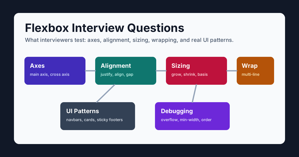
Table of Contents
- How to Answer Flexbox Interview Questions
- Flexbox Fundamentals
- Alignment and Centering Questions
- Flex Sizing Questions
- Wrapping and Responsive Layout Questions
- Practical UI Pattern Questions
- Advanced and Debugging Questions
- Quick Reference
How to Answer Flexbox Interview Questions
A strong Flexbox interview answer usually has three parts:
- Identify the logical axes. Explain
flex-direction, writing mode, and whether the requirement concerns main-axis flow or cross-axis alignment. - Choose the alignment or sizing property. Use
justify-contentfor the main axis,align-itemsfor the cross axis, andflexproperties when items should grow or shrink. - Mention the practical constraint. Centering needs free space, wrapping needs
flex-wrap, and relaxing an automatic minimum needs an explicit content-overflow policy.
For example, if asked how to center an element:
.container {
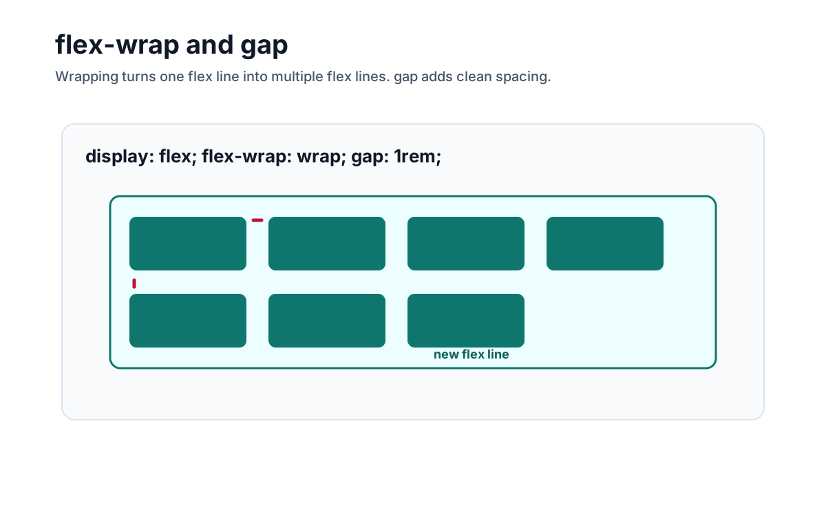
  display: flex;
  justify-content: center;
  align-items: center;
  min-block-size: 100dvh;
}
Then explain: justify-content centers on the main axis, align-items centers on the cross axis, and the block-size constraint creates free space in this example. Do not call those axes horizontal and vertical without stating the direction and writing-mode assumptions.
Flexbox Fundamentals
1. What is Flexbox?
Flexbox is a CSS layout model optimized for laying out items along a main axis, with sizing and alignment on a cross axis. Wrapping can create multiple flex lines, so “one-dimensional” describes its primary sizing relationship rather than everything it can render.
.toolbar {
  display: flex;
  align-items: center;
  gap: 0.75rem;
}
Use Flexbox when you want items to line up, share space, center, wrap, or push apart inside a component.
2. What is a flex container and a flex item?
A flex container is an element with display: flex or display: inline-flex. Its direct children become flex items.
<nav class="nav">
  <a>Docs</a>
  <a>Pricing</a>
  <button>Sign in</button>
</nav>
.nav {
display: flex;
}Only direct children become flex items. Elements nested inside those children are not flex items unless their own parent also uses Flexbox.
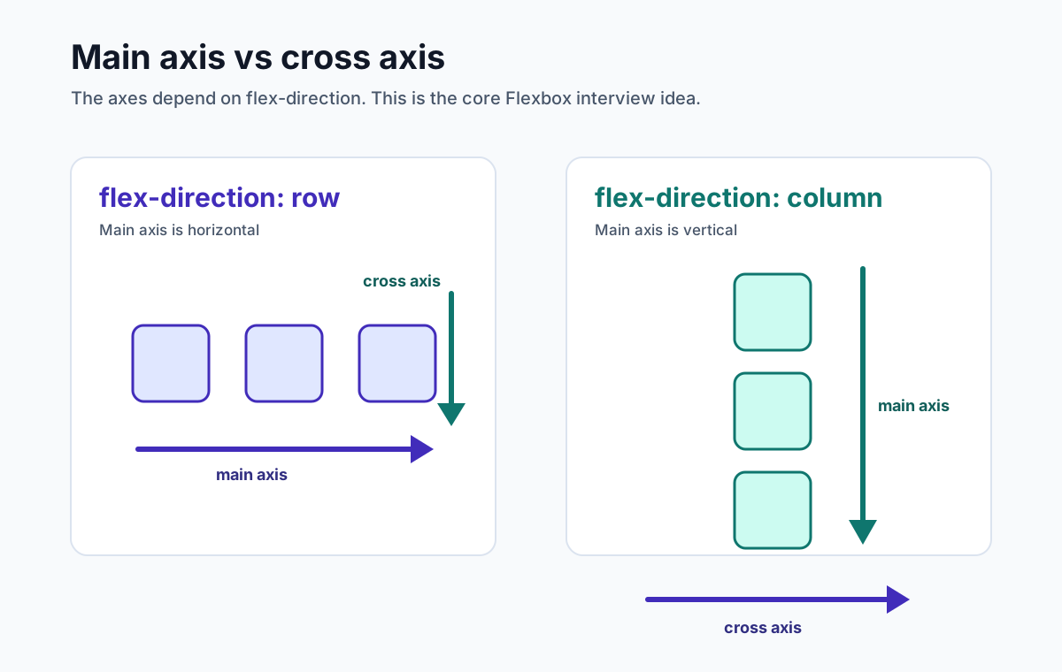
3. What are the main axis and cross axis?
The main axis is the direction flex items flow. The cross axis is perpendicular to it.
flex-direction and writing mode determine how main/cross directions map to physical directions. In the common horizontal left-to-right writing mode, row appears horizontal and column appears vertical, but that mapping is not universal.
4. What does flex-direction do?
flex-direction controls the main axis.
.row {
  display: flex;
  flex-direction: row;
}

.column {
  display: flex;
  flex-direction: column;
}
Common values:
| Value | Meaning |
|---|---|
row | Items flow from main-start to main-end along the inline axis |
row-reverse | Items flow in the reverse inline direction |
column | Items flow from main-start to main-end along the block axis |
column-reverse | Items flow in the reverse block direction |
In interviews, mention that changing flex-direction changes what justify-content and align-items affect.
5. What is the difference between Flexbox and CSS Grid?
Flexbox distributes and aligns items primarily along one main axis. Grid defines rows and columns together and lets items align to shared tracks. Both can affect two physical dimensions.
Use Flexbox when main-axis flow and space distribution dominate: toolbars, button groups, media objects, and many navigation or card internals.
Use Grid when items need shared row and column tracks: dashboards, aligned forms, galleries, and comparison layouts. Either tool can be used at page or component scale.
An interview-friendly summary:
Flexbox organizes flow around a main axis; Grid coordinates items against row and column tracks. Choose the relationship, not the component size.
Alignment and Centering Questions
6. How do you center an element with Flexbox?
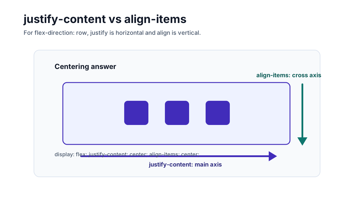
Use justify-content: center and align-items: center on the parent.
.container {
  display: flex;
  justify-content: center;
  align-items: center;
  min-block-size: 100dvh;
}
justify-content centers the flex items in available main-axis space. align-items centers them in their flex line on the cross axis. Visible centering requires free space, and the physical direction depends on flex-direction and writing mode.
7. What is the difference between justify-content and align-items?
justify-content aligns flex items along the main axis. align-items aligns flex items along the cross axis.
.row {
  display: flex;
  flex-direction: row;
  justify-content: center; /* main axis */
  align-items: center;     /* cross axis */
}

.column {
  display: flex;
  flex-direction: column;
  justify-content: center; /* main axis */
  align-items: center;     /* cross axis */
}
This is one of the most important Flexbox interview questions because it proves you understand axes rather than memorizing property names.
8. What are common justify-content values?
justify-content controls distribution along the main axis.
.nav {
  display: flex;
  justify-content: space-between;
}
Common values:
| Value | Effect |
|---|---|
flex-start | Pack items at the start |
flex-end | Pack items at the end |
center | Center items |
space-between | First item at start, last item at end, equal space between |
space-around | Equal space around each item |
space-evenly | Equal space between items and container edges |
9. What are common align-items values?
align-items controls how items align on the cross axis.
.cards {
  display: flex;
  align-items: stretch;
}
Common values:
| Value | Effect |
|---|---|
stretch | Stretch items to fill the cross axis, default in many cases |
flex-start | Align items at the cross-start |
flex-end | Align items at the cross-end |
center | Center items on the cross axis |
baseline | Align text baselines |
10. What is align-self?
align-self overrides align-items for a single flex item.
.item--featured {
  align-self: flex-start;
}
Use it when one item needs different cross-axis alignment from the rest of the group.
11. What is the difference between align-items and align-content?
align-items aligns items within a flex line. align-content distributes multiple flex lines along the cross axis.
align-content only has an effect when:
- The container uses
flex-wrap: wrap - There are multiple flex lines
- The container has extra cross-axis space
.tags {
  display: flex;
  flex-wrap: wrap;
  align-content: center;
  min-height: 240px;
}
If there is only one line, align-content will appear to do nothing.
12. How does gap work in Flexbox?
gap creates gutters between flex items and, when wrapping, between flex lines. It does not create outer spacing around the container.
.actions {
  display: flex;
  gap: 0.75rem;
}
It often expresses consistent internal gutters more directly than item margins. Margins and container padding still have separate uses, and the gap consumes layout space that percentage-based item widths must account for.
Flex Sizing Questions
13. What does flex: 1 mean?
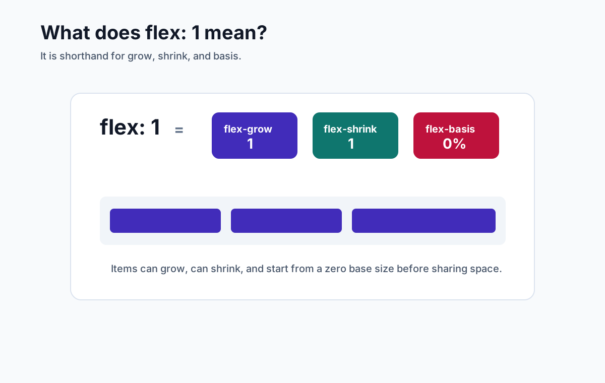
flex: 1 is shorthand for:
flex-grow: 1;
flex-shrink: 1;
flex-basis: 0%;
In browsers this normally computes to 1 1 0%: the item can grow and shrink from a zero-percent flex basis before free space is resolved.
Equal flex factors divide flex space equally, but padding, borders, min/max constraints, and automatic minimum sizes can produce unequal outer sizes.
14. What are flex-grow, flex-shrink, and flex-basis?
These three properties control flexible sizing.
| Property | Meaning |
|---|---|
flex-grow | Factor used to distribute positive free space |
flex-shrink | Factor, scaled by the flex base size, used for negative free space |
flex-basis | The initial main size used by the flex sizing algorithm |
.sidebar {
  flex: 0 0 16rem;
}

.main {
  flex: 1 1 auto;
}
The sidebar is inflexible at a 16rem basis, which can overflow a narrower container unless the design changes or wrapping is allowed. The main item participates in free-space distribution from its automatic basis.
15. What is the difference between flex-basis and width?
flex-basis is the initial size of a flex item along the main axis. width is a physical horizontal size.
In a row layout under a horizontal writing mode, the main size is commonly width; in a column layout it is commonly height. Other writing modes change the physical mapping.
.item {
  flex-basis: 12rem;
}
flex-basis supplies the flex base size. With flex-basis: auto, the main-size property can be consulted; a non-auto basis normally takes precedence for flex sizing. Min/max constraints and content still affect the used size.
16. What is the difference between flex: auto, flex: none, and flex: 1?
These shorthands are common in real code.
flex: initial; /* 0 1 auto */
flex: auto;    /* 1 1 auto */
flex: none;    /* 0 0 auto */
flex: 1; /* 1 1 0% */| Value | Best explanation |
|---|---|
flex: initial | Do not grow, can shrink, use automatic basis |
flex: auto | Can grow and shrink from the item's natural size |
flex: none | Do not grow or shrink |
flex: 1 | Share available space from a zero basis |
17. How do you make one item fill the remaining space?
Give the flexible item flex: 1.
.layout {
  display: flex;
}

.sidebar {
  flex: 0 0 280px;
}

.content {
  flex: 1;
  min-inline-size: 0;
}
In a horizontal row, min-inline-size: 0 deliberately allows the content item to shrink below its automatic min-content width. Then decide whether long content wraps, scrolls, or is truncated.
18. How do you create equal width columns with Flexbox?
Use flex: 1 on each item.
.columns {
  display: flex;
  gap: 1rem;
}

.column {
  flex: 1 1 0;
  min-inline-size: 0;
}
This gives each item the same flex basis and factors, but equal outer widths still depend on padding, borders, and constraints. For shared alignment across multiple rows, CSS Grid usually models the relationship more directly.
Wrapping and Responsive Layout Questions
19. What does flex-wrap do?
By default, flex items stay on one line and may shrink to fit. flex-wrap: wrap allows items to move onto new lines.
.chips {
  display: flex;
  flex-wrap: wrap;
  gap: 0.5rem;
}
This is common for tags, chips, filter controls, button groups, and responsive rows.
20. How do you build a responsive navbar with Flexbox?
Flexbox can lay out a navigation row, but a responsive menu also needs semantic links, a real disclosure button, synchronized state, keyboard behavior, and focus handling.
<nav class="navbar" aria-label="Primary">
  <a href="/">Brand</a>
  <button class="nav-toggle" aria-expanded="true" aria-controls="nav-links">
    <span class="visually-hidden">Close navigation</span>
    <span aria-hidden="true">☰</span>
  </button>
  <ul class="nav-links" id="nav-links">
    <li><a href="/docs">Docs</a></li>
    <li><a href="/pricing">Pricing</a></li>
  </ul>
</nav>
.navbar {
display: flex;
align-items: center;
justify-content: space-between;
gap: 1rem;
}
.nav-links {
display: flex;
align-items: center;
gap: 1.5rem;
}
.nav-toggle {
display: none;
}
@media (width < 45rem) {
.nav-toggle {
display: inline-flex;
}
.nav-toggle[aria-expanded="false"] + .nav-links {
display: none;
}
}Hide .nav-toggle by default in the wide layout. The initial expanded state leaves links usable without JavaScript; enhancement can collapse them, toggle aria-expanded and its label, support Escape, and restore focus predictably. Choose the breakpoint from actual content/zoom or use a container query for a reusable component.
21. How do you make a row of cards wrap responsively?
Use flex-wrap and give each card a flexible basis.
.cards {
  display: flex;
  flex-wrap: wrap;
  gap: 1rem;
}

.card {
  flex: 1 1 16rem;
  min-inline-size: min(100%, 16rem);
}
Each card prefers 16rem, can grow, and wraps as available space changes. Capping the minimum by 100% avoids forcing a wider-than-container item; confirm the sizing with real content.
If you need strict column alignment across rows, prefer CSS Grid:
.cards {
  display: grid;
  grid-template-columns: repeat(auto-fit, minmax(min(100%, 16rem), 1fr));
  gap: 1rem;
}
22. How do you create a layout that switches from row to column on mobile?
Change flex-direction in a media query.
.media {
  display: flex;
  gap: 1rem;
}

@media (width < 40rem) {
  .media {
    flex-direction: column;
  }
}
This pattern is common for media objects, feature rows, and split panels.
Practical UI Pattern Questions
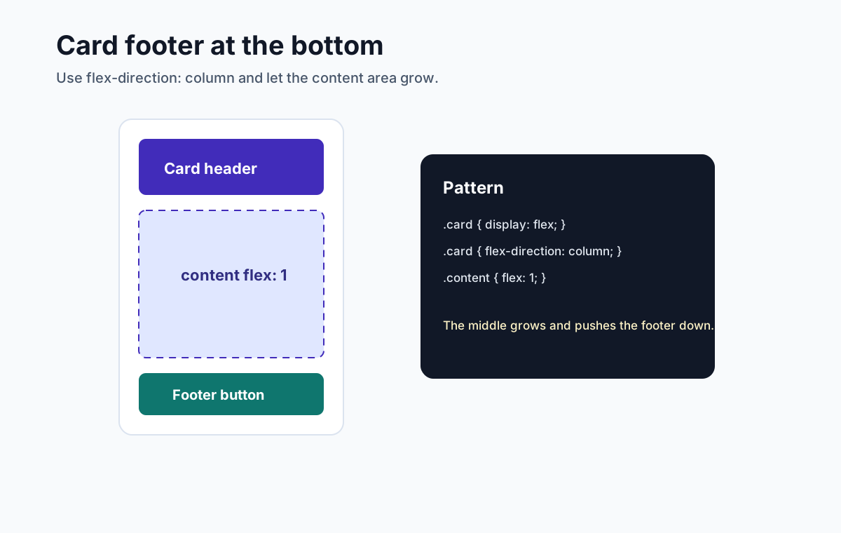
23. How do you create a card with the footer always at the bottom?
Use a column flex layout and let an auto block-start margin consume any remaining space above the footer.
.card {
  display: flex;
  flex-direction: column;
  min-block-size: 20rem;
}

.card-footer {
  margin-block-start: auto;
}
The card needs extra block-axis space for the margin to consume. Prefer a minimum rather than a fixed height when content can grow, and test text zoom and translations.
24. How do you create equal height columns?
In a row flex container, items whose cross size is auto normally stretch to the flex line's cross size because align-items: normal behaves as stretch in this context.
.row {
  display: flex;
  gap: 1rem;
}

.column {
  flex: 1 1 0;
  min-inline-size: 0;
}
Definite heights and min/max constraints can prevent stretching, and each line in a wrapped container sizes independently. Use Grid if items across different rows must align to shared tracks.
25. How do you push one flex item to the far right?
Use an auto margin on the main-start side of the item you want to push.
.nav {
  display: flex;
  align-items: center;
  gap: 1rem;
}

.login {
  margin-inline-start: auto;
}
In a horizontal row, the logical margin absorbs available inline/main-axis space. This avoids a spacer element and adapts to writing direction; map the logical side again if flex-direction changes.
26. How do you build a media object with Flexbox?
A media object has an image or icon on one side and content on the other.
.media {
  display: flex;
  gap: 1rem;
  align-items: flex-start;
}

.media-body {
  flex: 1;
  min-inline-size: 0;
}
Use min-inline-size: 0 only when the text area should shrink below its automatic minimum, then define wrapping, scrolling, or truncation deliberately.
Advanced and Debugging Questions
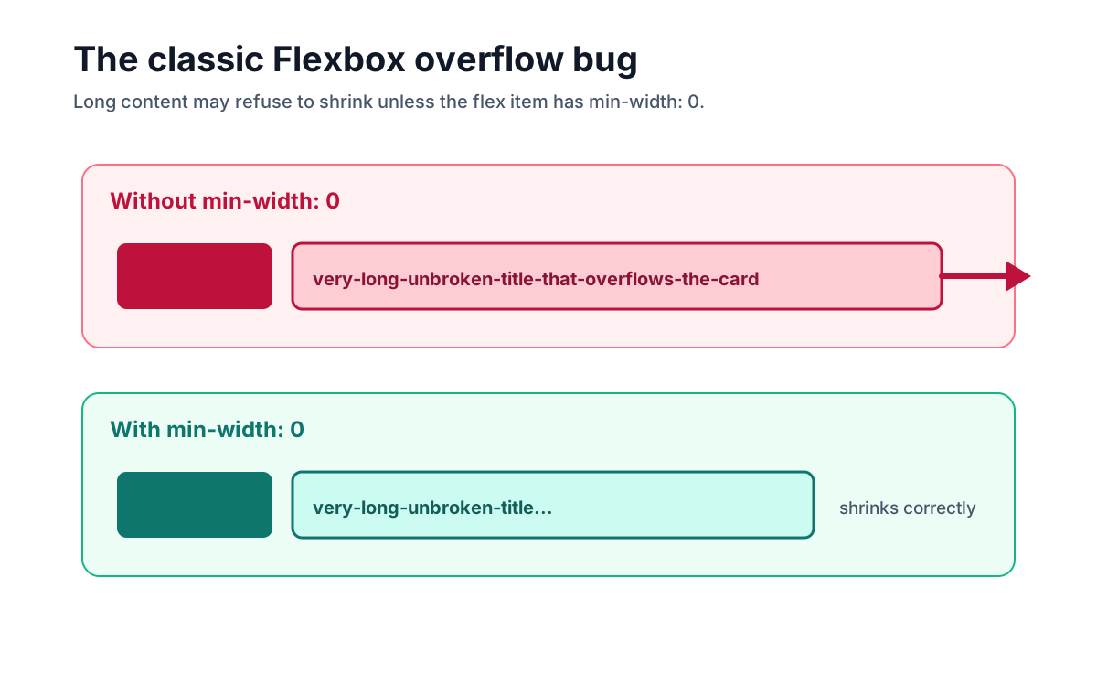
27. Why does a flex item overflow its container?
For a non-scrollable flex item, the automatic main-axis minimum often preserves a content-based minimum. Long text, tables, replaced elements, and code can therefore prevent shrinking.
If the design permits the item to shrink, use the logical minimum for a horizontal row and define the content behavior:
.content {
  flex: 1;
  min-inline-size: 0;
}

.title {
  overflow: clip;
  text-overflow: ellipsis;
  white-space: nowrap;
}
Truncation hides information, so expose the full value through an accessible interaction or choose wrapping/scrolling where possible. min-inline-size: 0 is not a universal fix for every axis or overflow requirement.
28. What does the order property do, and what is the accessibility risk?
order changes the visual order of flex items.
.featured {
  order: -1;
}
The accessibility risk is that visual order can differ from DOM reading and sequential focus order. Reversed flex directions create the same class of mismatch. Do not use visual reordering when sequence conveys meaning; put the DOM in a logical order that remains understandable across breakpoints.
29. What is the difference between display: flex and display: inline-flex?
Both create a flex formatting context for their children. The difference is how the container itself behaves.
| Value | Container behavior |
|---|---|
display: flex | A block-level flex container in the legacy single-keyword syntax |
display: inline-flex | An inline-level flex container in the legacy single-keyword syntax |
Both create the same flex formatting context for children. The difference is the container's outer display type; modern two-value syntax can express these as display: block flex and display: inline flex.
30. Is Flexbox good for full page layouts?
Yes. Flexbox can build a page through one or more flex containers. Choose Grid when page regions need shared row and column tracks; choose Flexbox when the dominant relationship is flow and free-space distribution on a main axis. Page versus component size is not the deciding rule, and combining formatting contexts is normal.
31. What common Flexbox bugs should you know?
| Problem | Cause | Fix |
|---|---|---|
| Centering appears to do nothing | No free space on the relevant axis or wrong axis assumption | Check flex-direction, writing mode, and size constraints |
| Long title overflows | Flex item automatic minimum plus content behavior | If shrinking is intended, use the logical min size and choose wrap/scroll/truncate |
align-content does nothing | Only one flex line exists | Use flex-wrap: wrap and create multiple lines |
| Columns are not equal height | Definite cross sizes, constraints, multiple lines, or non-stretch alignment | Inspect the used cross size; use Grid for shared rows |
| Visual order differs from tab order | order or reverse direction | Keep DOM order logical |
| Gutters and outer spacing conflict | One margin rule is doing both jobs | Use gap for gutters and container padding where appropriate |
32. What is a strong interview answer for Flexbox?
A strong answer connects the CSS to the layout reasoning:
"I would use Flexbox because the dominant relationship is flow and space distribution along one main axis.
flex-directionand writing mode map the logical axes;justify-contentdistributes main-axis free space andalign-itemscontrols cross-axis alignment. If one item should flex, I would choose grow, shrink, and basis deliberately. If content prevents shrinking, I would relax the logical minimum only after deciding whether the content wraps, scrolls, or is accessibly truncated."
That answer shows syntax, mental model, and debugging awareness.
Quick Reference
| Interview task | Flexbox answer |
|---|---|
| Create a flex container | display: flex; |
| Change the main axis | flex-direction: row or column |
| Center both axes | justify-content: center; align-items: center; |
| Add spacing | gap: 1rem; |
| Push item toward main-end in a row | margin-inline-start: auto; |
| Let item participate fully in free space | flex: 1; plus min/max/content checks |
| Allow a row item to shrink below min-content | min-inline-size: 0; plus an overflow policy |
| Allow wrapping | flex-wrap: wrap; |
| Make cards wrap | flex: 1 1 16rem; with a container-safe minimum |
| Equal height items in one line | Cross-size auto plus stretch alignment |
| Override one item alignment | align-self: center; |
| Avoid visual/source mismatch | Be careful with order |
Practice Exercise
Before the interview, practice explaining this navigation layout:
.nav {
  display: flex;
  align-items: center;
  gap: 1rem;
}

.nav-links {
  display: flex;
  gap: 1.25rem;
}

.nav-actions {
  margin-inline-start: auto;
  display: flex;
  gap: 0.75rem;
}
A good explanation:
"The dominant relationship is one navigation row, so Flexbox is a good fit.
align-items: centeraligns items on the cross axis,gapcreates internal gutters, andmargin-inline-start: autoabsorbs free space before the actions in the common row direction. I would still test long labels, writing direction, zoom, wrapping, and the accessible mobile disclosure behavior."
Frequently Asked Questions
What Flexbox interview questions should I prepare for?
Prepare for main and cross axes, writing modes, flex-direction, alignment, flex-grow, flex-shrink, flex-basis, shorthand values, wrapping, gaps, auto margins, ordering, responsive navigation, card layouts, automatic minimum sizes, overflow, and accessibility.
What is Flexbox used for?
Flexbox lays out and distributes items primarily along a main axis and aligns them on a cross axis. It is useful for toolbars, button groups, navigation, media objects, card internals, centering, wrapping, and other layouts whose dominant relationship is flow along one axis.
What is the difference between Flexbox and CSS Grid?
Flexbox distributes and aligns items primarily along one main axis, although wrapping creates multiple lines. Grid defines rows and columns together and aligns items to shared tracks. Choose from the relationships the layout needs, not a universal component-versus-page or content-versus-layout rule.
How do you center an element with Flexbox?
Set display: flex on the parent, use justify-content: center on the main axis, and align-items: center on the cross axis. Which physical directions those axes represent depends on flex-direction and writing mode, and visible centering requires usable free space on the relevant axes.
What does flex: 1 mean?
In browsers, flex: 1 normally computes to flex: 1 1 0%, so the item can grow and shrink from a zero-percent basis. Equal flex factors share flex space, but they do not guarantee equal outer sizes when padding, borders, automatic minimum sizes, or other constraints differ.
Why does a Flexbox item overflow and how do you fix it?
A flex item's automatic main-axis minimum can preserve min-content width, so long text, tables, or code may prevent shrinking. If the design permits shrinking, use min-inline-size: 0 in a row and then choose content behavior deliberately, such as wrapping, scrolling, or accessible truncation.
Official Sources
- CSS Flexible Box Layout Module Level 1
- CSS Box Alignment Module Level 3
- CSS Display Module Level 3
- CSS Writing Modes Level 4
- CSS Logical Properties and Values Level 1
- WCAG 2.2: Understanding Focus Order
Related Articles
- CSS Flexbox & Grid Interview Guide - broader comparison of Flexbox and Grid interview patterns
- CSS Grid Interview Questions - focused guide to Grid questions, examples, and layout diagrams
- Complete Frontend Developer Interview Guide - full frontend interview roadmap
- HTML5 Accessibility Interview Guide - semantic HTML, ARIA, keyboard access, and accessibility questions